A Chart is a graphic representation of data. Charts allow users to see what the results of data would be for better understanding and predict current and future data. Charts are often used to ease understanding of large quantities of data and the relationships between parts of the data. Data is shown through bar chart, line chart or pie chart etc. Logic DB-Design allows its users to create Charts for better explanation of the reports.
 New Chart Creation
Click on the Add Sheet to add a Chart in your DB-Design. Then, click on Add Chart from the top options of the window.
OR
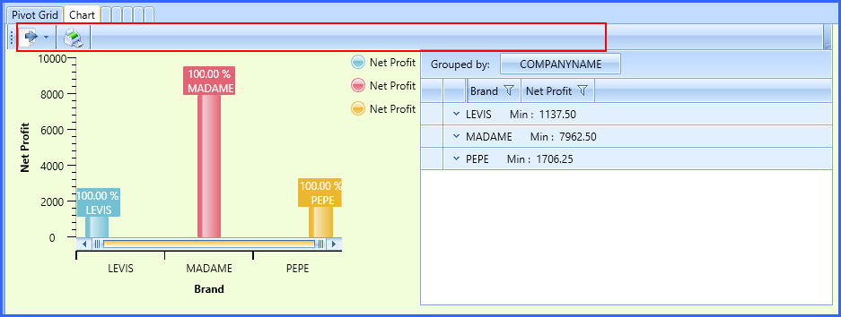
Right click on the existing sheet (Pivot Grid) and Click on the Add Sheet. Then, Click on the New Sheet Object and then, Chart option.
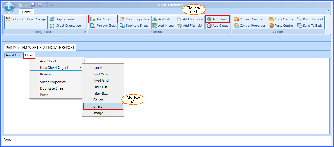
Fig 1. Add Chart
Chart Properties window will appear on your screen. See window below:
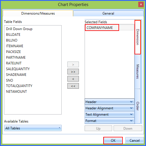
You will see two tabs on the top of the window. One is for Dimensions/ Measures and another is for General Properties.
In the middle of the window, there are two sets of arrow buttons. One is for Single arrows and another is Double arrows. Single arrow is used to transfer the items from Table field to Selected Field and Double Arrows are used to transfer it from Selected Field to Table Fields.
Use Arrows to transfer your items from Table Fields to Selected Fields. See the window below:

|
1) You can also Double click on the item to transfer it from one table to another.
2) You can change the header name of every field and the changed name will be visible in the DB-Design.
|
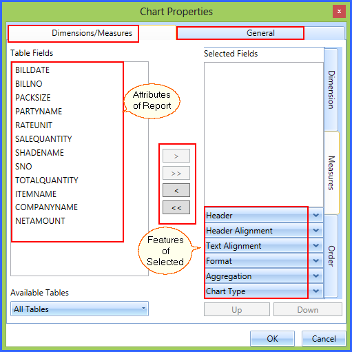
Fig 2. Chart Properties
Back To Top
Chart Properties
Chart Properties could be of two types. You need to categorize your items as per its properties. These properties are as mentioned below:
Dimensions/ Measures
General
1. Dimensions/ Measures
Dimensions/ Measures could be of three types. You need to select your required features from these properties available. These are as follows:
1) Dimensions
Fig 3. Dimension
 Dimensions Properties: Dimensions are the alpha numeric header given to a Field Item for representing quantitative display of data. Dimensions are those things you want to track.
Header
|
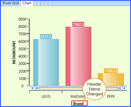
You can change the header name of any field from the first properties of Dimension tab. Select any item from Selected Field and click on the Header Tab. For example: In the below window Company Name is changed to Brand.
It can be viewed in the DB-Design View as well.
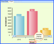
Fig 4. Header Dimension
|
2) Measures
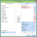
Fig 5. Measure
Measures Properties: Measures are the quantities you want to measure. Such as: Sale Quantity, Net Amount etc.
Header
|
You can change the header name of any field by simply clicking on the Header feature of Measure field. For example: In the below window NET AMOUNT is changed to NET PROFIT.
. It can be viewed in the DB-Design View as well.
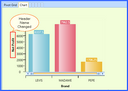
Fig 6. Header Measure
|
Aggregation
|
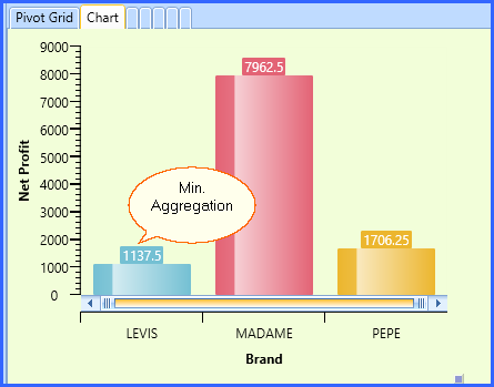
You have the option to decide the type of Aggregation system to be used while tabulating the report. Aggregation is a function where different values are of multiple rows are grouped together on a certain criteria to form a single value. For example: Min. Aggregation is applied on the Net Amount field in the below window:
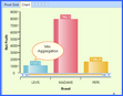
Fig 7. Aggregation Measure
|
Chart Type
|
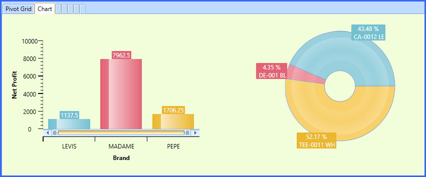
Logic DB-Design allows you to design your Chart in multiple ways. You can create a chart with Bar Chart, Bar Chart 3D, Cone Chart, Funnel, Pie etc. There are many options available. See the window below to create same data in multiple ways:

Fig 8. Chart Type
|
3) Order
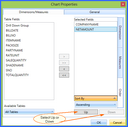
Fig 9. Order
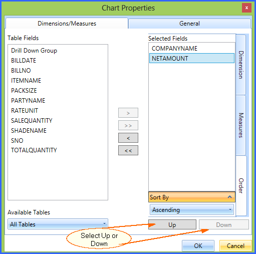
Order Properties: You can change the order of the fields through Order Properties. You can keep the items on your desired number through this option.
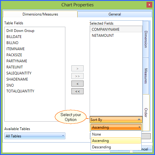
Sort By
|
You can sort the properties in two ways ascending and descending order. Sort By option allows you to sort in the desired order.

Fig 10. Sort By
|
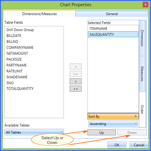
Up & Down
|
Up and Down buttons allow you to change the position of the field items upward and downward.
Select the item you want to move and click on up or down from the Order Properties.
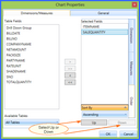
Fig 11. Up & Down
|
Back To Top
2. General
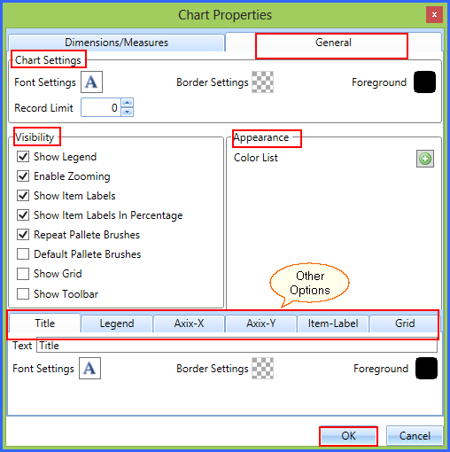
General Tab is used to change the General Settings of the Chart.
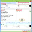
Fig 12. General Properties
Chart Settings:
Chart Settings
|
You can use Chart Settings to improve the look and feel of the chart. This option allows you to change the style of the Font, Background settings, Foreground Color and control the Record Limit.
Fig 13. General Chart Settings
|
Visibility and Appearance: You can select the visibility and appearance of your chart through these available options. Just tick the options you want to display and uncheck all other options.
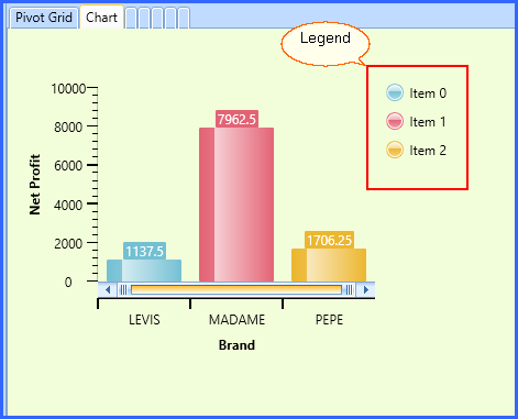
Show Legend
|
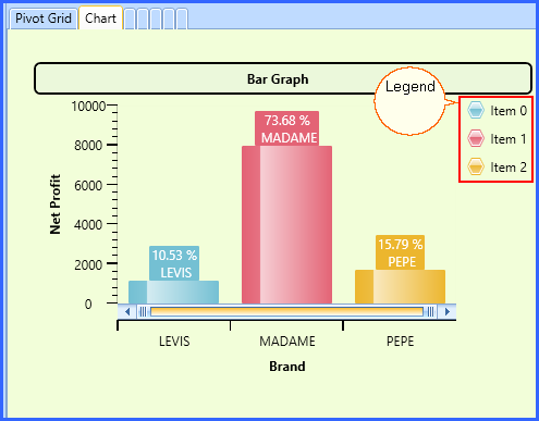
The legend is linked to the data being graphically displayed in the plot area of the chart. The legend is also known as a Chart's Key.
Legend is the graphic pointers in the form of shapes like Circle, Squares, Triangle etc with the color used to represent the data in the Legend and the Chart.
You can have the control that whether you want to display it in your Chart or not. If you want to Show it, check the checkbox and remove the tick if you don't want to show it.
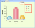
Fig 14. Legend
|
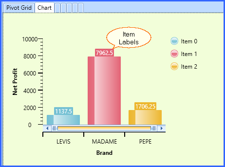
Show Item Labels
|
Item Label is used to display the information about the items used in the Chart
Logic DB-Design allows you to control its visibility. If you want to show item Labels, Check the Show Item Labels and uncheck if you don't want to show it.
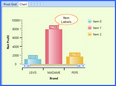
Fig 15. Item Labels
|
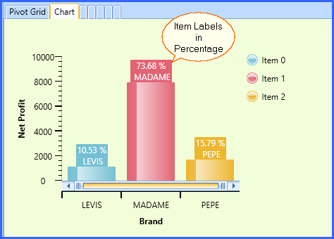
Show Item Labels in Percentage
|
Item Label is used to display the information about the items used in the Chart in Percentage.
Logic DB-Design allows you to control its visibility. If you want to show item Labels, Check the Show Item Labels and uncheck if you don't want to show it.
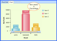
Fig 16. Item Labels in Percentage
|
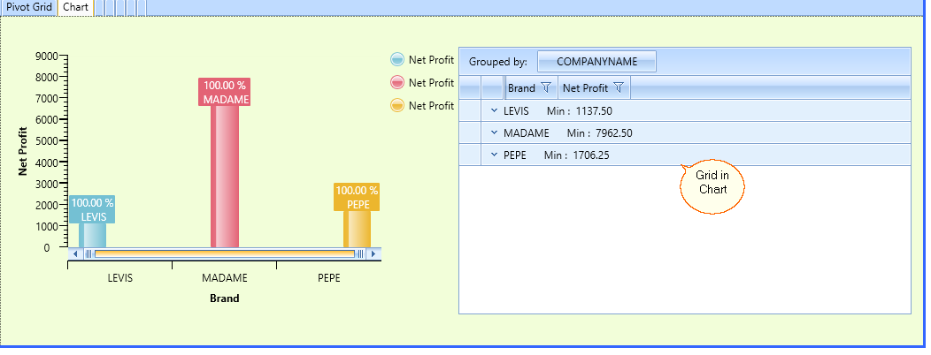
Show Grid
|
Grids are made up of table borders that surround each side of a cell. Grids can be used for making lists of items
You can see grid in your chart by clicking on the Show Grid. It will look as follows:
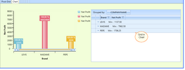
Fig 17. Show Grid
|
Show Toolbar
|
Toolbar contains the options to Export and Print the data.
You can add the toolbar by selecting Show Toolbar. See the window below:
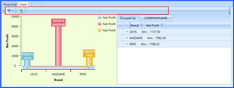
Fig 18. Show Toolbar
|
Appearance
|
Change the appearance of your chart adding colors in it. Click on the '+' to add the color of your choice.

Fig 19. Appearance
|
Other Settings:
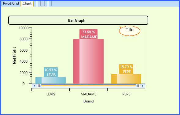
Title
|
Click on the Title Tab to make your Title look stylish. You can change the Title through Text bar, change the settings of Font & Border and use a stylish Foreground color to make your chart look attractive.
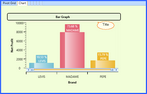
Fig 20. Title
|
Legend
|
Legend is the graphic pointers in the form of shapes like Circle, Squares, Triangle etc with the color used to represent the data in the Legend and the Chart.
This tab allows you to design your dashboard in a beautiful way. You can make many changes in your chart through it. You can make following changes in your dashboard through this tab.
Marker Shape
Display Mode
Legend Type
Position
Font Settings
Background
Foreground (Text Color)
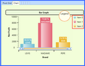
Fig 21. Legend
|
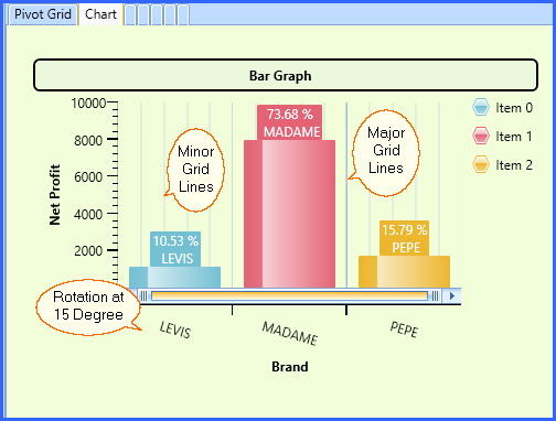
Axis-X
|
You can modify the Axis-X of the data through this tab. It allows you to rotate the data according to your requirement for better look and understanding.
If you want to Show Axis-X, Check the box. Also, It allows you to Select Major Grid Lines and Minor Grid Lines.
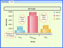
Fig 22. Axis-X
|
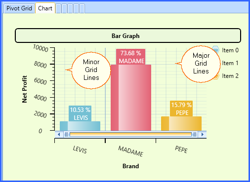
Axis-Y
|
You can modify the Axis-Y of the data through this tab. It allows you to rotate the data according to your requirement for better look and understanding.
If you want to Show Axis-Y, Check the box. Also, It allows you to Select Major Grid Lines and Minor Grid Lines.
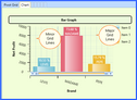
Fig 23. Axis-Y
|
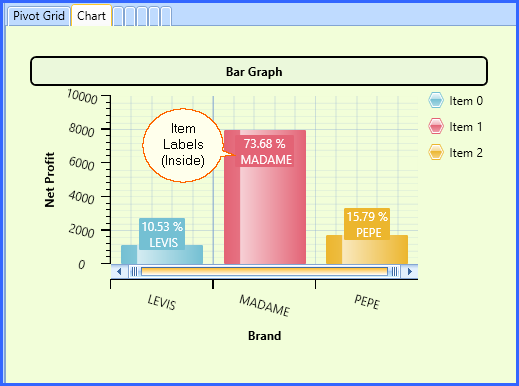
Item Label
|
You can design the style of item labels through this tab. You can perform the following changes through this option:
| • | Inside: You can write the Item Labels inside the Bar through this option. |
| • | Outside: You can write the Item Labels outside the Bar through this option. You can select the distance between the bar and item label and have option to Connect the Bar and Item Labels has well with the Connector checkbox. |
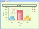
Fig 24. Item Labels
|
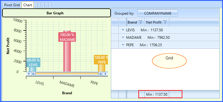
Grid
|
Grids are made up of table borders that surround each side of a cell. Grids can be used for making lists of items.
You can change the Foreground and Border color, Position of the Grid, Font Settings and Show Footer as well. It will look as follows:
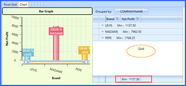
Fig 25. Grid
|
Back To Top
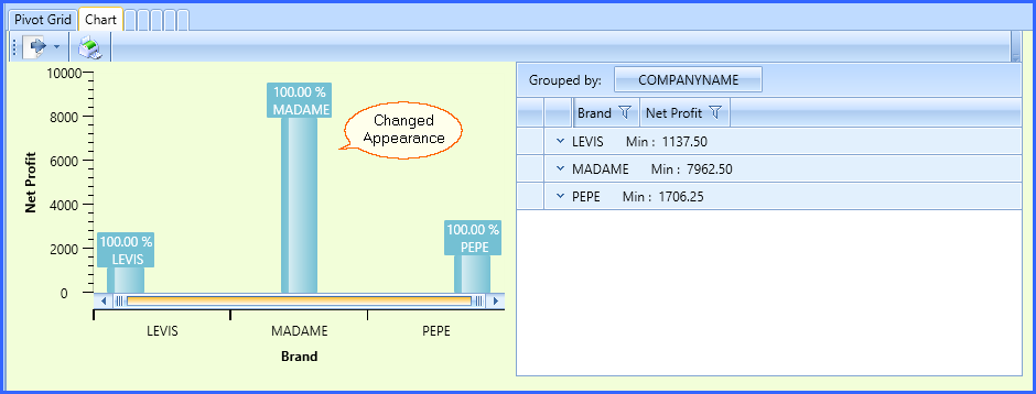
After Applying all the properties, Final Chart will be created. Take a look at Different types of Charts with different Fields.
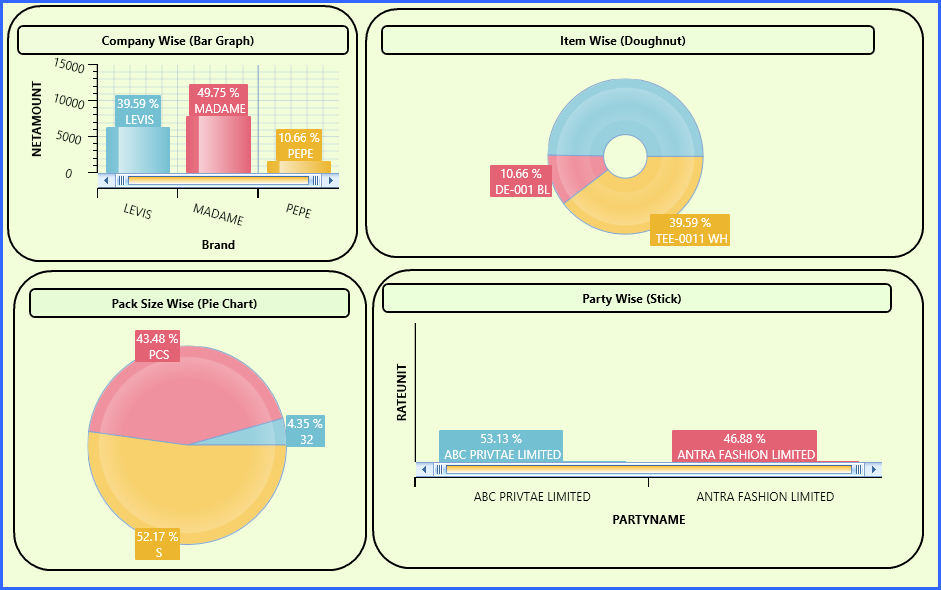
Fig 26. New Chart
Back To Top