|
Grid View |
  
|
| Show/Hide Hidden Text |
|
Grid View |
|
| Show/Hide Hidden Text |
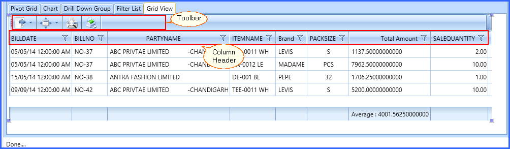
 Grid View is also known as Data Grid. It is a graphical Control Element in which data is displayed in the tabular Form (In the form of tables). The Grid View control enables you to select, sort, and edit various items. It is commonly used to display lists of data and information through some common known field items like Company Name, Party Name, Net Amount, Sale Quantity etc..
 New Grid View Creation:
Click on the Add Sheet to add a Grid View in your DB-Design. Then, click on Add Grid View from the top options of the window.
OR
Right click on the existing sheet (Filter List) and Click on the Add Sheet. Then, Click on the New Sheet Object and then, Grid View option.
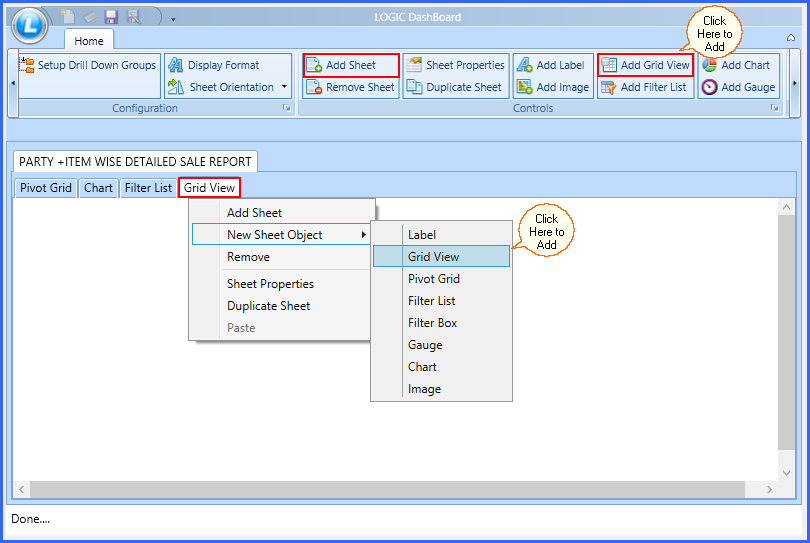
Fig 1. Create Grid View
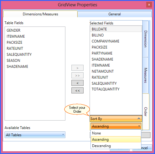
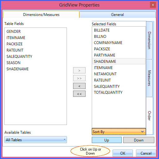
Grid View Properties window will appear on your screen. See window below:
You will see two tabs on the top of the window. One is for Dimensions/ Measures and another is for General Properties.
In the middle of the window, there are two sets of arrow buttons. One is for Single arrows and another is Double arrows. Single arrow is used to transfer the items from Table field to Selected Field and Double Arrows are used to transfer it from Selected Field to Table Fields.
Use Arrows to transfer your items from Table Fields to Selected Fields. See the window below:
|
1) You can also Double click on the item to transfer it from one table to another. 2) You can change the header name of every field and the changed name will be visible in the DB-Design. |
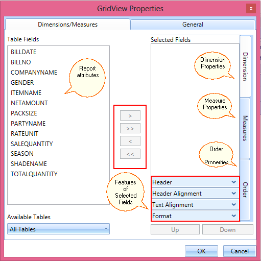
Fig 2. Grid View Properties
Grid View Properties
Grid View Chart Properties could be of two types. You need to categorize your items as per its properties. These properties are as mentioned below:
Dimensions/ Measures
General
| 1. | Dimensions/ Measures |
Dimensions/ Measures could be of three types. You need to select your required features from these properties available. These are as follows:
1) Dimensions
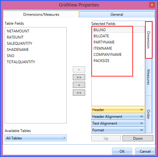
Fig 3. Dimension
 Dimensions Properties: Dimensions are the alpha numeric header given to a Field Item for representing quantitative display of data. Dimensions are those things you want to track.
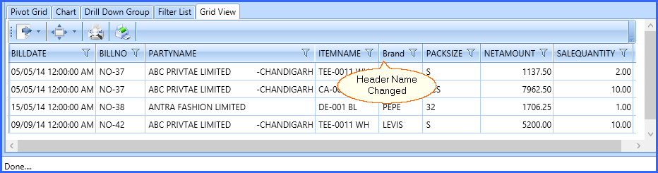
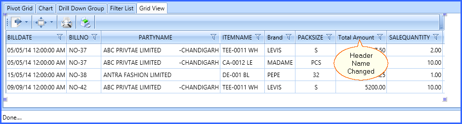
Header |
Fig 4. Header |
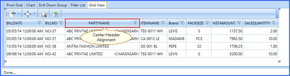
Header Alignment |
Fig 5. Header Alignment |
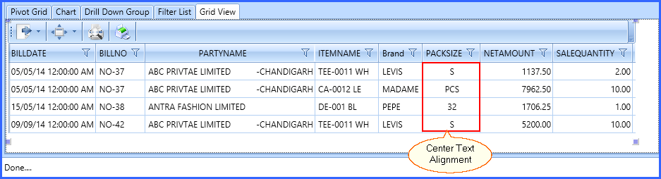
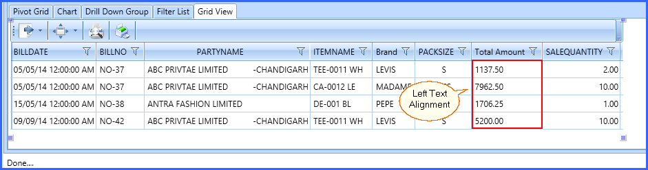
Text Alignment |
Fig 6. Text Alignment |
2) Measures
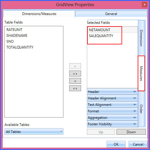
Fig 7. Measure
Measures Properties: Measures are the quantities you want to measure. Such as: Sale Quantity, Net Amount etc.
Header |
Fig 8. Header |
Header Alignment |
|
Text Alignment |
Fig 9. Text Alignment |
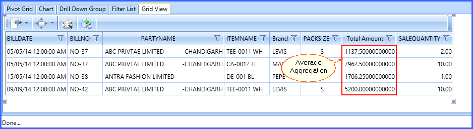
Aggregation |
Fig 10. Aggregation |
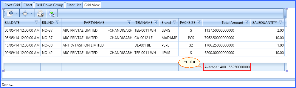
Footer Visibility |
Fig 11. Footer |
3) Order
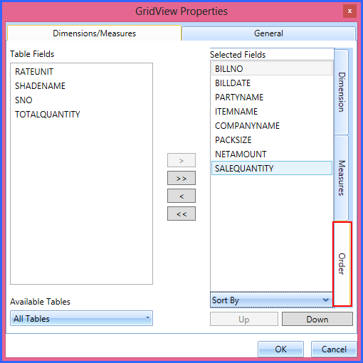
Fig 12. Order
Order Properties: You can change the order of the fields through Order Properties. You can keep the items on your desired number through this option.
Sort By |
Fig 13. Sort By |
Up & Down |
Fig 14. Up & Down
|
2. General
General Tab is used to change the General Settings of the Chart.
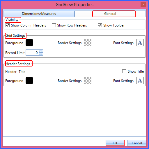
Fig 15. General Properties
Visibility
Grid Settings
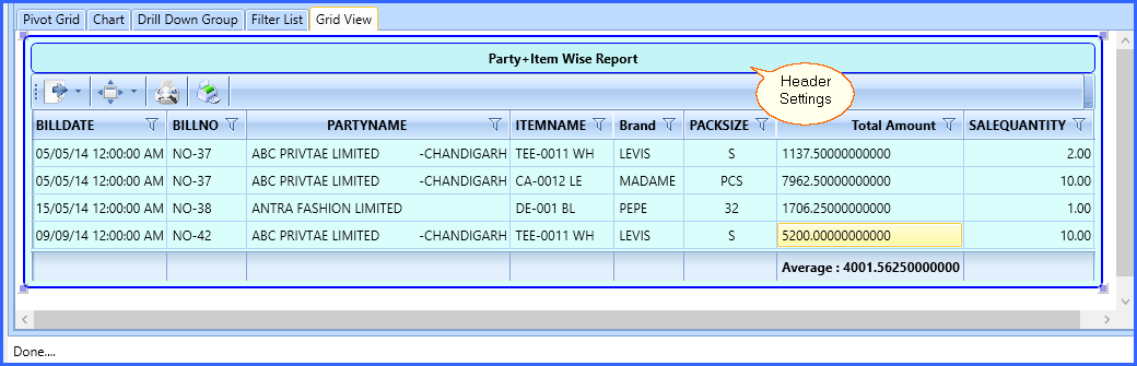
Header Settings
Visibility |
Fig 16. Visibility
|
Grid Settings |
Fig 17. Grid Settings
|
Header Settings |
Fig 18. Header Settings
|
After Applying all the properties, Final Grid View will look as follows:
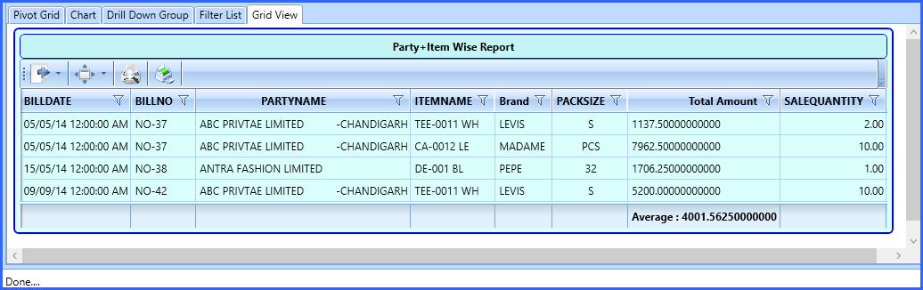
Fig 19. Grid View Final