Best Practices for a High-Converting Order Form Format

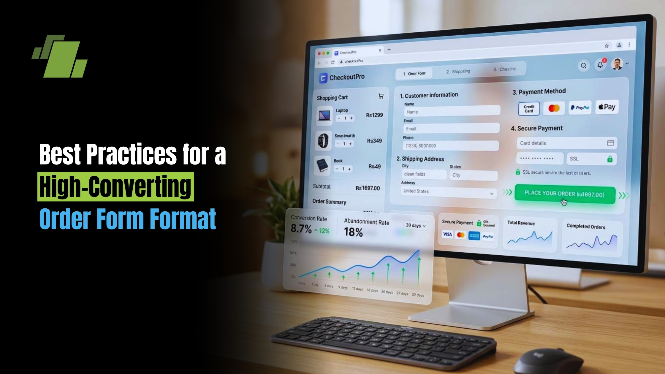
Efficient order management is the backbone of a smooth customer buying experience. Have you ever tried buying something online, but the checkout page was so confusing you simply gave up? Common consumer research reveals this exact moment is where businesses lose the most sales. Your order form or order sheet is much more than a basic data sheet; think of it as your digital shop’s physical store counter. Imagine walking up to a real-world cash register covered in clutter, where someone demands your life history just to sell you a coffee. You would likely walk away.
Perfecting your order form format serves as the final handshake between you and your buyer. A firm handshake builds trust while guaranteeing you collect accurate shipping details without sending endless “what did you mean by this?” emails later. According to e-commerce industry data, simplifying this experience directly boosts your conversion rates meaning more visitors actually finish buying what they started. A clean layout prevents abandoned carts and keeps that digital counter spotless.
Contact Us
Free Demo Request
Mastering the Essential Sales Document Input Fields to Prevent Customer Confusion
When checkout feels like a background check, buyers abandon their purchases. When building an order form template, you must separate “nice-to-have” details from absolute essentials. Every extra box increases the chance a customer walks away. For example, demanding a phone number often makes buyers hesitate and actually hurts sales.
To keep your order book format clean, focus strictly on essential sales document input fields. Mark these specific items as mandatory so the buyer cannot skip them:
- Full Name
- Shipping Address
- Product Name
- Quantity
Gathering this information is a great start, but ensuring accuracy requires a simple tool called “field validation.” Think of validation like a polite cashier double-checking a handwritten note. It automatically stops the buyer from submitting the form if an email is accidentally missing the “@” symbol, saving you from bounced messages and lost orders.
Designing a Professional Order Sheet Format that Guides the Eye
Customers scanning your order sheet format naturally read in a “Z-pattern,” sweeping across the screen from top-left to right, then darting diagonally down. To match this habit, your order form format needs visual hierarchy which simply means making the most important parts stand out. Use bold text for titles to guide their attention smoothly toward the payment button. Whether you’re using an order form template or a custom layout, the goal is the same: keep the path to purchase obvious and simple.
Grouping similar questions acts exactly like organized aisles in a grocery store. When shoppers buy baking supplies, they expect flour and sugar right next to each other. Apply this same logic to establish visual hierarchy in professional invoices and checkout pages. Keep all contact details in one block and order specifics in another so buyers never feel disoriented.
Stacking these grouped sections in a single, straight line down the page works much better than a cluttered side-by-side grid. A simple vertical column prevents eye fatigue and takes the guesswork out of where the customer should click next. This clean layout keeps momentum high, allowing you to speed up the transaction even further.
Reducing Shopping Cart Abandonment with One Simple Shipping Checkbox
Typing an address twice is a guaranteed way to frustrate customers. We must collect an exact billing address to match the credit card a security step known as billing and shipping data validation. However, most people just ship items to their own home. Forcing everyone to re-type details causes lost sales. By adding a simple “Same as shipping address” checkbox, you eliminate redundant typing for most buyers, directly reducing shopping cart abandonment rates.
Setting up this time-saver works like a friendly shortcut at a physical cash register. To create this seamless experience in your digital form builder, follow these three steps:
- Add the field: Place a checkbox directly under the shipping section.
- Link the data: Tell the form to automatically copy those shipping details.
- Hide the billing block: Make the extra address boxes disappear when the box is checked.
How Conditional Logic Keeps Your Order Form From Looking Overwhelming
Imagine a customer ordering a custom cake at a bakery. You wouldn’t ask about frosting colors if they only bought a muffin. Your digital form should be exactly that smart. This trick is called “conditional logic,” which is just a simple “If/Then” rule. If a customer chooses a certain option, then a new box pops up just for them.
Using conditional logic for dynamic fields keeps your page clean while managing complex requests. Think about offering a gift wrapping service. Instead of showing ribbon choices to every single person, you just ask, “Is this a gift?” If they click “Yes,” those extra boxes magically appear. This creates a user-friendly product selection interface that never overwhelms regular buyers and keeps your order form format tidy.
Hiding irrelevant questions until they are needed keeps your checkout short and inviting. Customers finish faster because they aren’t confused by options that don’t apply to them. As you see how these smart digital tools save everyone time, you might rethink your other daily operations.
Online Versus Paper-Based Intake Systems: Choosing the Right Workflow
Transitioning from a classic order book template to a digital form feels like a big leap, but it comes down to how you prefer to work. When evaluating online versus paper-based intake systems, think about a busy bakery counter. Paper is incredibly reliable, but writing things down means you must manually copy that data later. Digital forms capture customer details perfectly the first time, completely eliminating manual data entry at the end of the day.
The biggest advantage of going digital is when your form talks directly to your stockroom through automated inventory management synchronization. If you only have five cakes left, the form automatically stops taking orders once they sell out, preventing embarrassing “out of stock” apologies. Consider these workflow tradeoffs:
- Pros of Digital: Auto-sync prevents overselling, payments process instantly, and there is zero bad handwriting to decode.
- Pros of Paper: No internet connection is needed, and you always have a tangible physical record.
Whether you stick with a paper order book format or fully migrate to a digital order book template, standardizing your process will reduce errors and speed up fulfillment.
Securing Your Customer’s Trust with Safe Payment Gateways
Handling money online can feel intimidating, but you should never store credit card numbers yourself. Think of a payment gateway as a highly trained digital cashier. This service securely takes the customer’s payment information, talks to their bank, and drops funds into your account, effortlessly protecting your business from massive security risks.
Matching this digital cashier to your business size is critical. A local baker might use simple tools like Square or Stripe, while a larger retailer might need advanced routing features. Regardless of the provider you choose, a secure payment gateway integration directly inside your order form template prevents customers from being awkwardly redirected to an unfamiliar website just to pay.
Visual cues tell your buyers their money is safe during this final step. Small details, like the little padlock icon in your web address known as an SSL certificate and familiar credit card logos near the total, act as powerful trust signals. Once customers feel confident paying, ensuring they can easily finish the purchase on mobile devices is the final hurdle.
Optimizing Checkout Flow for Mobile Users with Thumb-Friendly Design
Imagine a customer ordering on their phone while holding a coffee. If they struggle to tap “Buy,” they leave. Optimizing checkout flow for mobile users is vital for increasing conversion rates on sales pages meaning more visitors actually finish paying. Follow the “One Thumb” rule: if buyers cannot complete the form using one thumb, it is too complex.
Eliminate the frustration of pinching and zooming by testing your form’s readability on small screens. Let phones instantly enter saved data to reduce mobile abandonment. Always meet this mobile checklist:
- Large tap targets
- No tiny text
- Minimal typing
- Auto-fill enabled
Transforming Your Feedback: A 3-Step Action Plan for Your New Order Form Format
You started wondering how to arrange a few text boxes, but you now understand how to build a seamless checkout experience. Remember, your form is the final handshake with your customer make it confident and clear. If you are wondering what are the best digital form builders to use, beginner-friendly options like Typeform or Google Forms are perfect starting points. Follow this action plan:
- Pick a builder: Select the right tool for your technical comfort level.
- Add essential fields: Only ask for what you absolutely need to complete the sale.
- Send a test order: Establish a routine for checking and fulfilling new orders, and apply order confirmation email best practices to build post-sale trust.
Every time a buyer breezes through your layout without emailing you for help, you will see the value of a well-crafted design. You are now ready to take orders like a pro.

Call at +91-73411-41176/75 or send us an email at sales@logicerp.com to book a free demo of order mangement software today!
Frequently Asked Questions (FAQs)
1. Which fields should be mandatory on a high-converting order form?
Keep only the essentials mandatory: Full Name, Email, Shipping Address, Product Name, and Quantity. Asking for extras (like a phone number) often increases hesitation and hurts conversions. Use field validation to catch simple mistakes (for example, blocking emails without an “@”) so you get accurate details without back-and-forth emails.
2. How should I structure the layout so customers move smoothly to payment?
Design for the natural Z-pattern: use clear, bold titles and a strong visual hierarchy that guides the eye toward the checkout button. Group related inputs (contact details together, order specifics together), and stack sections in a single vertical column rather than side-by-side grids. This reduces eye fatigue, eliminates guesswork, and keeps buying momentum high.
3. How does a “Same as shipping address” checkbox reduce cart abandonment, and how do I implement it?
It removes redundant typing for most buyers, speeding checkout and lowering drop-off. Implement it by:
- Adding a checkbox directly under the shipping section
- Linking the data so shipping details auto-copy to billing when checked
- Hiding the billing address fields when the box is checked
4. What is conditional logic, and when should I use it?
Conditional logic shows extra fields only when they’re relevant, keeping the form short and focused. For example, ask “Is this a gift?” and display wrapping and ribbon options only if the customer selects “Yes.” This minimizes clutter, prevents overwhelm, and speeds completion for users who don’t need those options.
5. How can I build trust at payment and make checkout easy on mobile?
Use a secure, integrated payment gateway (e.g., Square or Stripe for smaller businesses; more advanced routing for larger ones) and never store card numbers yourself. Display trust signals like an SSL padlock and familiar card logos. For mobile, follow the “One Thumb” rule with large tap targets, readable text, minimal typing, and autofill enabled to prevent pinching, zooming, and form fatigue.

Author
Gurbir Singh
Co-founder & Managing Director | LOGIC ERP Solutions Pvt. Ltd.
With 30+ years of experience in the tech industry, I took the helm of technology & product development, ensuring LOGIC ERP’s continuous innovation & leadership in the evolving tech landscape.